
【React/Next.js】Chakra UI の基本的な使い方【TypeScript 対応】
2021/10/01

はじめに
どーも、入田 / ぐるたか @guru_taka です!
本記事では React/Next.js (TypeScript) における Chakra UI の基本的な使い方を紹介します。レスポンシブ対応や独自 CSS の記述方法など便利な Tips もまとめていますので、ぜひ参考にしてみてください!
本記事では React/Next.js (TypeScript) における Chakra UI の基本的な使い方を紹介します。レスポンシブ対応や独自 CSS の記述方法など便利な Tips もまとめていますので、ぜひ参考にしてみてください!
Chakra UI の導入方法については、以下の記事にまとめています。
参考:Next.js (JavaScript/TypeScript) に Chakra UI を導入する方法 | fwywd(フュード)
基本的に Next.js の PJ をベースとして、解説しています。もし、掲載しているコードが React で動作しない場合は、ディレクトリ構造やコードを適宜、確認してください。
バージョン情報
- node:15.11.0
- react: 17.0.2
- react-dom: 17.0.1
- next: 11.1.2
- @chakra-ui/react: 1.6.7
- @emotion/react: 11
- @emotion/styled: 11
- framer-motion: 4
基本的な書き方
Chakra UI は基本的にコンポーネントベースで記述します。例は以下の通りです。
- グルーピングなど頻繁に使う
divタグ →Boxコンポーネント - 見出しで使用する
h1~h6タグ →Headingコンポーネント - 文章を記述するための
pタグ →Textコンポーネント buttonタグ →Buttonコンポーネント
コードで表現すると、以下のようになります。
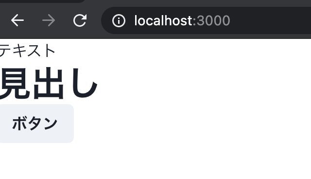
// pages/index.tsx
import { Heading, Box, Button, Text } from '@chakra-ui/react';

export default function Index(): JSX.Element {
  return (
    <Box>
      <Text>テキスト</Text>
      <Heading>見出し</Heading>
      <Button>ボタン</Button>
    </Box>
  );
}
上記で紹介した Chakra UI のコンポーネントは極一部です。
Form で頻繁に使う UI コンポーネントも当然ありますし、実装が煩雑なオーバレイ系やフィードバック系 UI コンポーネント(モーダル、トースタ、スケルトンなど)も標準で搭載。さらに、便利なパンくずリストやアコーディオンなどもあり、よく使う UI コンポーネントがほぼ網羅されています。
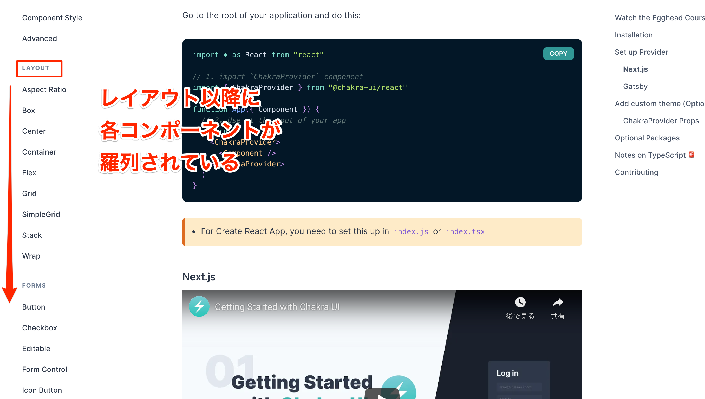
下図のように公式ドキュメントの左サイドバーに、搭載されている UI コンポーネントが羅列されています。ぜひ確認してみてください!
基本的には、Chakra UI の機能が搭載されたコンポーネントで記述して、実装を進めましょう!
スタイリングの方法
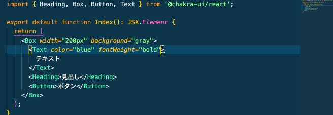
Chakra UI のコンポーネントに対し、スタイリングする場合は props を使います。例えば、フォントの太さや色、横幅などを変更したい時、コードは以下のようになります。
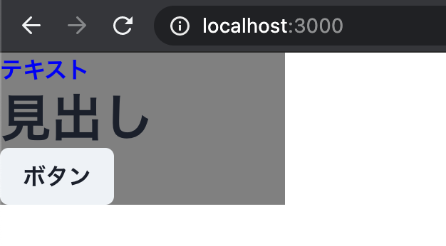
// pages/index.tsx
import { Heading, Box, Button, Text } from '@chakra-ui/react';

export default function Index(): JSX.Element {
  return (
    <Box width="200px" background="gray">
      <Text color="blue" fontWeight="bold">
        テキスト
      </Text>
      <Heading>見出し</Heading>
      <Button>ボタン</Button>
    </Box>
  );
}
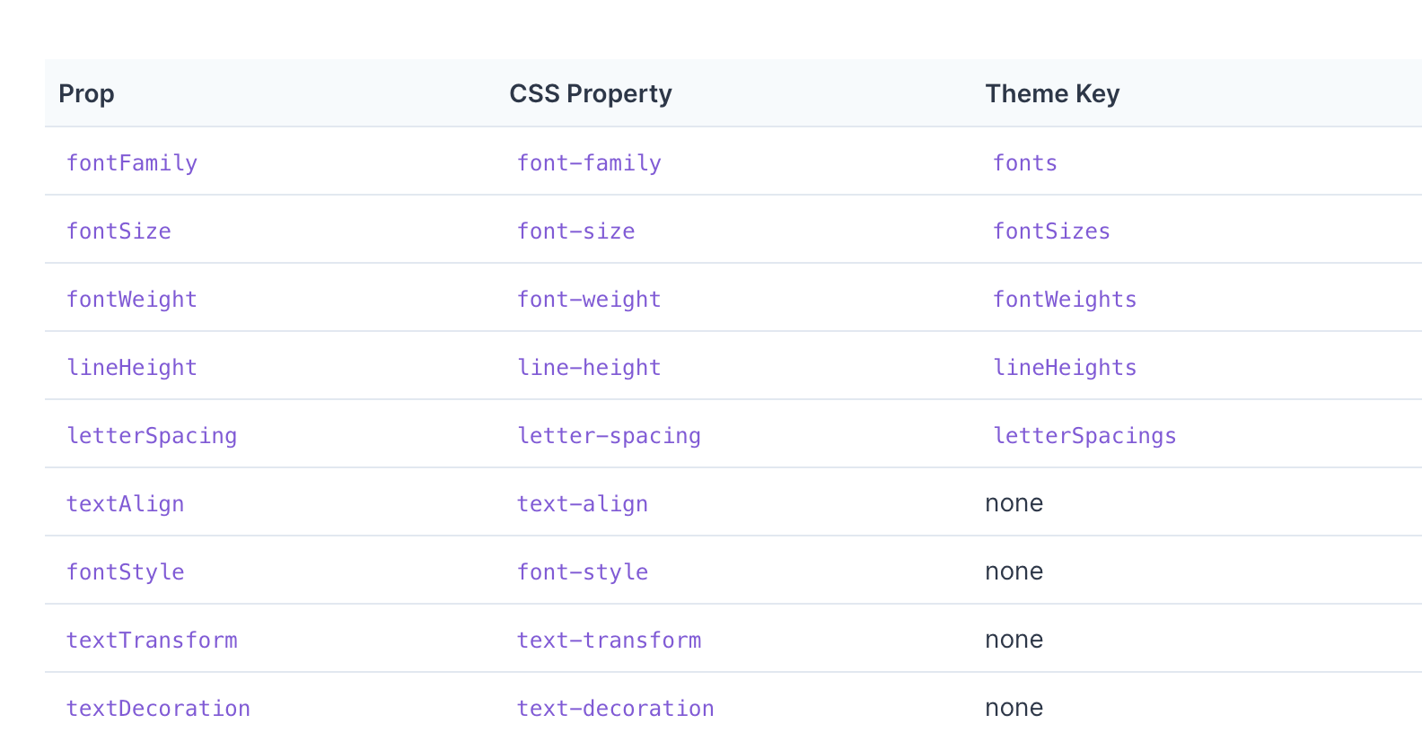
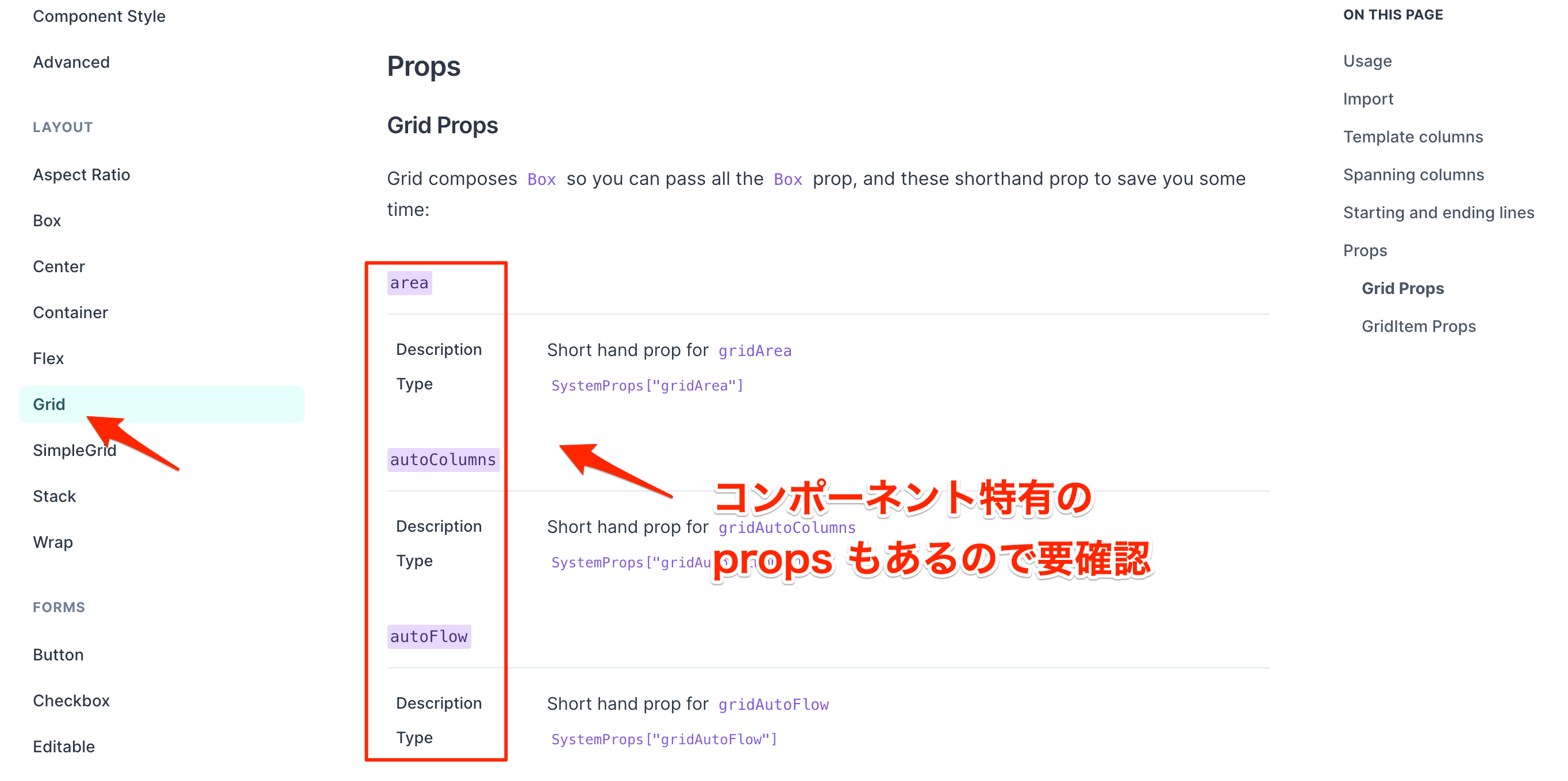
Chakra UI コンポーネントの props に関しては、Style Props(下図参照)に掲載されています。種類が非常に多いため、必要に応じて確認すると、良いでしょう。
Chakra UI は TypeScript に対応しているため、VS Code による補完が効きます。そのため、開発体験が良いです!
また、Tailwind CSS と同じように、
2xl や 3xl など、デフォルトの変数が用意されていますが、10px など適切な値を代入することも可能です。▼ 補完の様子
更に、一部の props に関しては、ショートハンド(型も対応)で表現できます。長めの props 名に関しては、略を使うと良いでしょう。以下、例になります。
width→wheight→hbackground→bg
その他、UI コンポーネント特有の props もあります。その場合は、各コンポーネントのドキュメントに詳細(下図参照)がありますので、適宜、確認してみてください。
もし、一部のコンポーネントで、特定の props が使えない場合は、使用した props が対応しているかどうか、公式ドキュメントで確認しましょう。経験則になりますが、そのような場合は対応していないケースが多いです。
レスポンシブ対応
レスポンシブ対応したい時は、以下のようにコードを記述します。
// pages/index.tsx
import { Heading, Box, Button, Text } from '@chakra-ui/react';

export default function Index(): JSX.Element {
  return (
    // 追記:横幅をレスポンシブ対応
    <Box w={{ base: '150px', sm: '300px', md: '500px', lg: '700px', xl: '1000px' }} bg="gray">
      <Text color="blue" fontWeight="bold">
        テキスト
      </Text>
      <Heading>見出し</Heading>
      <Button>ボタン</Button>
    </Box>
  );
}
各プロパティの意味は以下の通りです。
base:From0emより大きい場合sm:From30em(デフォルト値)より大きい場合md:From48em(デフォルト値)より大きい場合lg:From62em(デフォルト値)より大きい場合xl:From80em(デフォルト値)より大きい場合
実はオブジェクト形式だけでなく、以下のように配列でも記述できます。
// 配列
["150px", "300px", "500px", "700px","1000px"]

// オブジェクト
{ base: '150px', sm: '300px', md: '500px', lg: '700px', xl: '1000px' }
しかし、配列で記述すると、閾値が直感的にわからないため、可読性の観点からオススメしません。そのため、基本的にはオブジェクト形式でレスポンシブ対応を表現すると、良いでしょう。
疑似要素のスタイリング
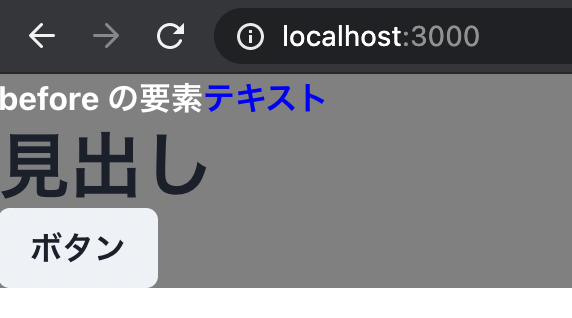
疑似要素に関しては、以下のように
_ を先頭に付けて、表現します。以下、例になります。_before/_after_hover_focus
サンプルコードは以下の通りです。
import { Heading, Box, Button, Text } from '@chakra-ui/react';

export default function Index(): JSX.Element {
  return (
    <Box>
      <Text color="blue" fontWeight="bold" _before={{ content: '"before の要素"', color: 'white' }}>
        テキスト
      </Text>
      <Heading>見出し</Heading>
      <Button>ボタン</Button>
    </Box>
  );
}
詳細は公式ドキュメントを御覧ください。
コンポーネントの html タグの変更
各コンポーネントの html タグを変更する場合は、
as という props を使用します。例えば、
Heading コンポーネントの html をタグを h1 ~ h6 に割り振る方法は以下の通りです。<Heading as="h1">h1</Heading> <Heading as="h2">h2</Heading> <Heading as="h3">h3</Heading> <Heading as="h4">h4</Heading> <Heading as="h5">h5</Heading> <Heading as="h6">h6</Heading>
他にも自由に html タグを変更できます!
独自 CSS の記述方法
Chakra UI に搭載されていないスタイルを適用する場合は、
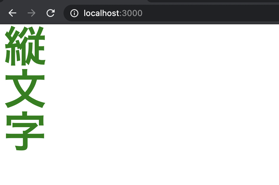
sx という props を使用します。例えば、テキストを縦文字で表現したい場合、独自の CSS を記述する必要があり、コードは以下のようになります。
import { Heading, Box, Button, Text } from '@chakra-ui/react';

export default function Index(): JSX.Element {
  return (
    <Box
      sx={{
        // セレクタ
        '.vertical-mode': {
          // プロパティと値
          writingMode: 'vertical-rl',
        },
      }}
    >
      {/* sx で定義したクラス名 ".vertical-mode" を className に代入  */}
      <Heading className="vertical-mode" color="green" fontSize="7xl">
        縦文字
      </Heading>
    </Box>
  );
}
sx の props を使用することで、独自 CSS も簡単に適用できます!Chakra UI のようなコンポーネント定義
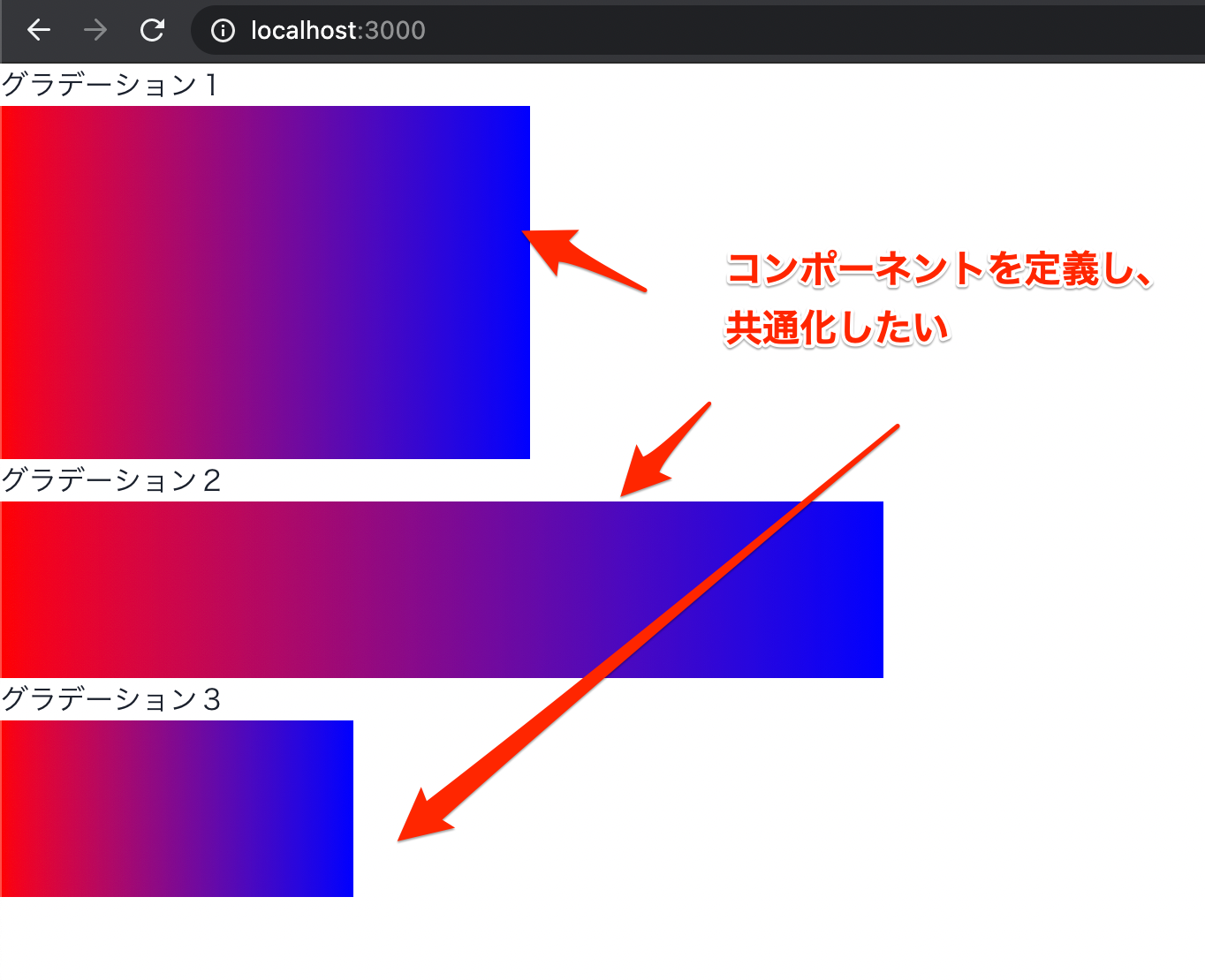
Chakra UI の機能を持たせたコンポーネントを定義したいケースも多々あります。
例えば、以下のようなグラデーションがかかった
Box コンポーネントを再利用したいとします。import { Box, Text } from '@chakra-ui/react'; export default function Index(): JSX.Element { return ( <Box> <Text>グラデーション1</Text> <Box bgGradient="linear(to-r, red,blue)" w="300px" h="200px" /> <Text>グラデーション2</Text> <Box bgGradient="linear(to-r, red,blue)" w="500px" h="100px" /> <Text>グラデーション3</Text> <Box bgGradient="linear(to-r, red,blue)" w="200px" h="100px" /> </Box> ); }
グラデーションのかかった
Box コンポーネントをコンポーネント化すると、以下のようになります。// components/GradientBox.tsx import { Box, BoxProps } from '@chakra-ui/react'; import { ReactNode } from 'react'; // BoxProps を継承 interface Props extends BoxProps { children?: ReactNode; } export default function GradientBox({ children, ...rest }: Props): JSX.Element { return ( <Box bgGradient="linear(to-r, red,blue)" {...rest}> {children} </Box> ); }
そして、定義した
GradientBox コンポーネントで共通化すると、以下のようになります。import { Box, Text } from '@chakra-ui/react'; import GradientBox from 'components/GradientBox'; export default function Index(): JSX.Element { return ( <Box> <Text>グラデーション1</Text> <GradientBox w="300px" h="200px" /> <Text>グラデーション2</Text> <GradientBox w="500px" h="100px" /> <Text>グラデーション3</Text> <GradientBox w="200px" h="100px" /> </Box> ); }
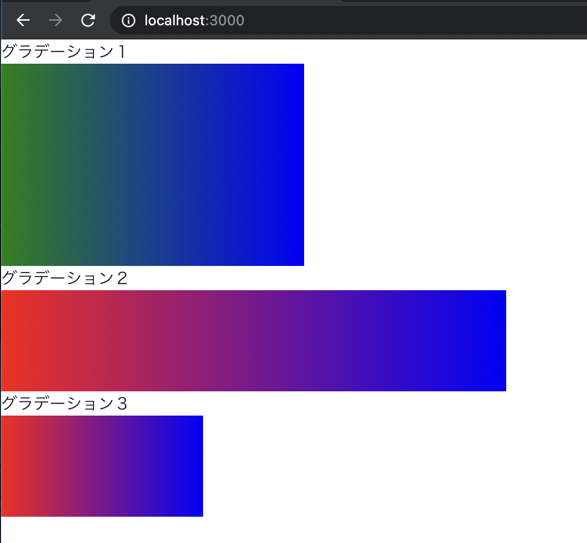
補足になりますが、
bgGradient に別のグラデーション値を代入すると、以下のように背景色が上書きされます。import { Box, Text } from '@chakra-ui/react'; import GradientBox from 'components/GradientBox'; export default function Index(): JSX.Element { return ( <Box> <Text>グラデーション1</Text> {/* 別のグラデーション */} <GradientBox bgGradient="linear(to-r, green,blue)" w="300px" h="200px" /> <Text>グラデーション2</Text> <GradientBox w="500px" h="100px" /> <Text>グラデーション3</Text> <GradientBox w="200px" h="100px" /> </Box> ); }
もし、
bgGradient の値を固定し、props から除外したい場合は、継承する BoxProps から bgGradient を取り除きましょう。コードは以下のようになります。import { Box, BoxProps } from '@chakra-ui/react'; import { ReactNode } from 'react'; // Omit で bgGradient だけ除外 interface Props extends Omit<BoxProps, 'bgGradient'> { children?: ReactNode; } export default function GradientBox({ children, ...rest }: Props): JSX.Element { return ( <Box bgGradient="linear(to-r, red,blue)" {...rest}> {children} </Box> ); }
他にも、
width(ショートハンド w)と height(ショートハンド h)だけ、継承することも可能です。import { Box, BoxProps } from '@chakra-ui/react'; import { ReactNode } from 'react'; // Pick で 横幅と縦幅のみ継承 interface Props extends Pick<BoxProps, 'width' | 'height' | 'w' | 'h'> { children?: ReactNode; } export default function GradientBox({ children, ...rest }: Props): JSX.Element { return ( <Box bgGradient="linear(to-r, red,blue)" {...rest}> {children} </Box> ); }
他にも TypeScript の Utility Types を使うことで、props の様々な制御が可能です。
以下の記事も参考になりますので、ぜひチェックしてみてください!
【補足】汎用性の高い便利なコンポーネント集
補足として、個人的に使いやすかった汎用性の高い Chakra UI 標準の UI コンポーネントを紹介します。
- Box
- 基本中の基本(
div)
- 基本中の基本(
- Container
- メインコンテンツやサイドバーのラッパーに最適
- Center
- 縦と横の中央寄せ
- 縦の中央寄せしたい時に便利
- VStack / HStack / Stack
- 縦 / 横 / 縦 or 横の均等配置が簡単に実装可能
- レスポンシブ対応で、縦横の並びが変わる時は、Stack を使うこと
Spacerコンポーネントも使うことで、space-betweenと同様の効果が得られる
- SimpleGrid
- シンプルなグリッド表示
その他にも便利な UI コンポーネントが Chakra UI には多数あるので、ぜひ確認してみてください!
最後に
以上になります。React/Next.js で Chakra UI を使い始めた方の参考になれば幸いです。
ここまでご覧いただき、ありがとうございました!
ここまでご覧いただき、ありがとうございました!
参考文献
新着記事


関連記事


新着記事new

Markdoc (Tailwind UI の Syntax ベース)による Markdown Viewer の実装
2022/08/09▶︎ view more

【Azure App Service | Node.js】GitHub Actions を利用して継続デプロイしてみよう【 トラブルガイド付】
2022/08/06▶︎ view more

ライター直伝!読みやすさに差をつける文章濃縮術
2022/07/28▶︎ view more

井の中の蛙が人の力を引き出す、群に対する教育の設計術 ~ 専門家が怖くて発言できない、こんな世の中に ~
2022/07/28▶︎ view more

想像していたよりもはるか簡単に社長になった話
2022/07/27▶︎ view more
著者